Mellow
Daytrip
A change of pace,
in a can.
The idea
A small escape.
Any day of the week.
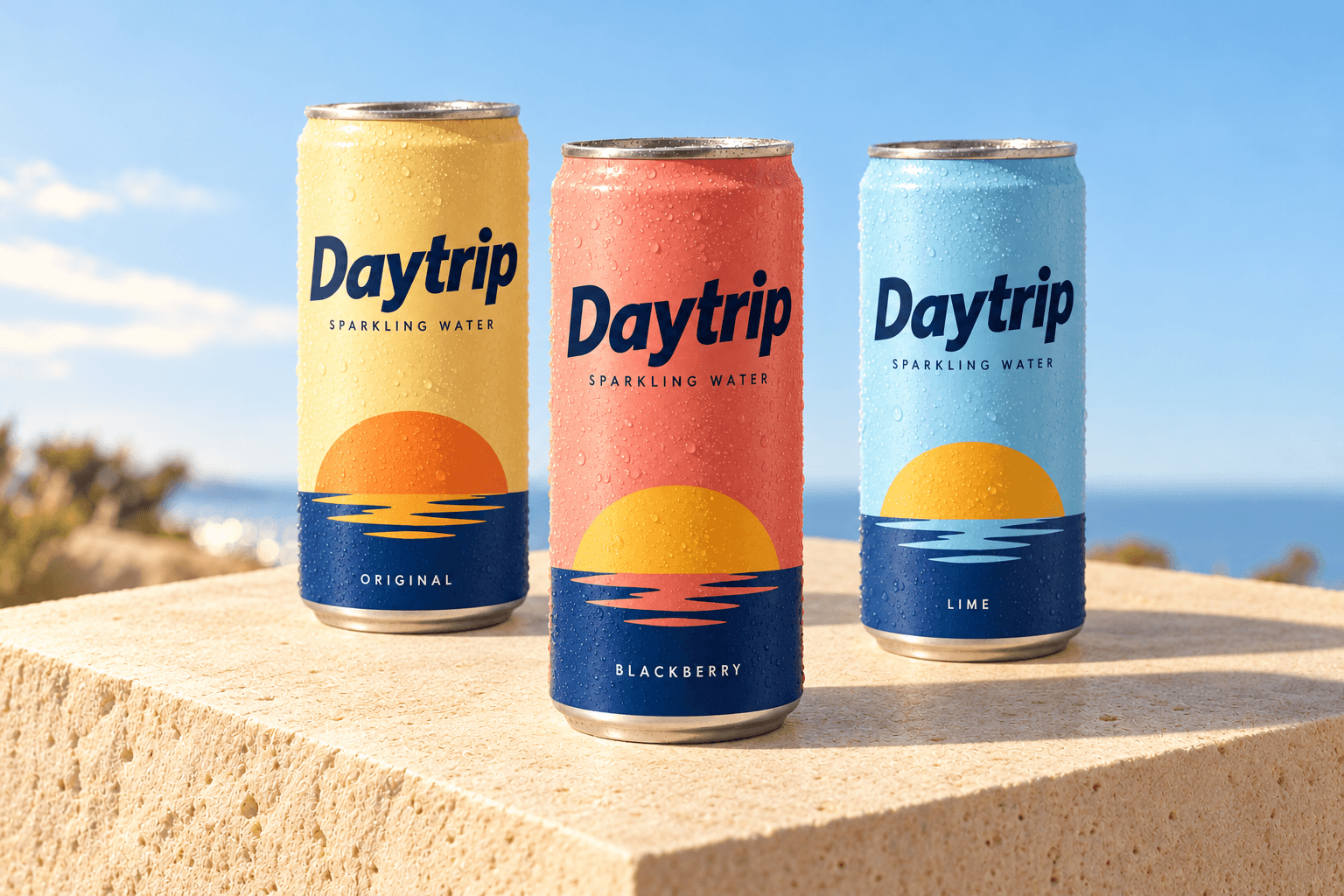
Daytrip is a sparkling water concept built around a simple feeling: stepping out of your routine, even for a moment. A little sun. A different view. Something to look forward to.
We gave that feeling a bright, easygoing identity. The horizon becomes a recurring graphic, each flavor gets its own color, and expressive lettering brings the whole thing to life.
Daytrip
Optimistic. Easygoing.
A little further out.
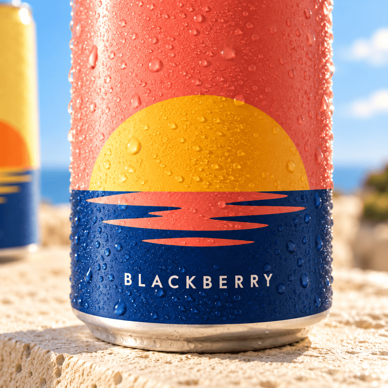
A horizon worth coming back to.
Color, with a point of view.
A sunny palette grounded in deep blue. Each flavor has room to be itself while the range feels like one family.
Sunshine
#F0CF6DOriginal. An easy, optimistic starting point.
Coral
#E5A18FBlackberry. Warmth with a little personality.
Sky
#A9C9DCLime. A fresh breath of open air.
Deep water
#193442The anchor. Lettering, horizons, and small details.
Keep deep blue for lettering and key details. Pair it with one flavor color at a time, and give the graphics space to breathe.
Type & tone
A little character.
Plenty of clarity.
Forward-leaning lettering gives the wordmark its energy. A simple sans serif keeps flavor names and product details clear, so personality and practicality work together.
The voice follows the same idea: short, warm, and lightly playful. An invitation to take a break, without making a big thing of it.
Open a little escape.
Take the scenic route.
Nothing on the agenda.
Making it work
One idea.
Room to go places.
On packaging, the wordmark leads, the horizon wraps around the can, and flavor sits in a consistent position. Across print and digital, the same colors, cropped horizons, and open space carry the identity forward.
This is an independent studio concept, created to explore a complete brand direction for sparkling water.